Copper color planning
Free copper hair color try on: copper, auburn, or burgundy?
Compare three very different red families on one controlled photo, then turn the most convincing direction into a realistic color consultation.
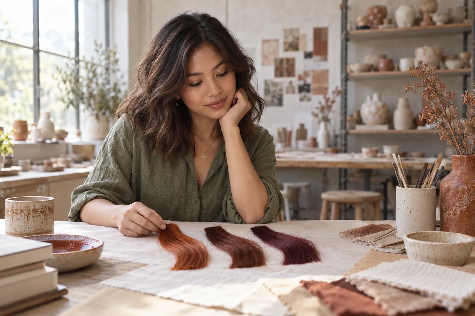
A free copper hair color try on is most useful when it helps you choose a direction, not when it tries to sell one perfect shade. Copper, auburn, and burgundy are often grouped together as red hair, yet they create very different relationships with skin, brows, clothing, and a natural base. Copper is visibly orange-gold, auburn anchors red in brown, and burgundy moves toward wine, berry, or violet. On a small swatch all three may look appealing. Around the whole face, one can feel bright and energetic, another quiet and believable, and another deliberately dramatic.
This guide gives that decision a repeatable structure. You will make one neutral source photo, compare the three families before chasing tiny shade names, check the shortlist in ordinary light, and record the practical facts a preview cannot know. Hair Muse is free to download; some previews or usage levels may require an in-app purchase. Its images are visual planning aids rather than promises about lift, chemistry, condition, fading, or the exact result of a salon service. The goal is to arrive with a clear preference, a realistic fallback, and better questions for a qualified colorist.
Define the decision in a free copper hair color try on
Begin with the broadest useful question: do you want the result to read as orange-copper, brown-red, or violet-red? Do not start by comparing labels such as cinnamon, cowboy copper, cherry cola, rust, mahogany, and wine. Those names are not standardized, and two reference images with the same label may differ in depth, warmth, saturation, lighting, and editing. A family-first comparison keeps the decision visible. You can refine brightness and placement after you know which relationship suits the effect you want.
Write a one-line brief: ‘I want a warm red that still feels believable with my brows,’ or ‘I want a deeper statement color without bright orange.’ Add one boundary, such as limited lightening, a graceful grow-out, low contrast, or infrequent maintenance. Use that brief to judge every preview.
- Copper: orange-gold warmth with the clearest bright-red impression
- Auburn: red moderated by brown, often quieter and deeper
- Burgundy: red shifted toward berry, wine, or violet
- Your decision: family first, then depth, intensity, and placement
Build one neutral photo before changing the color
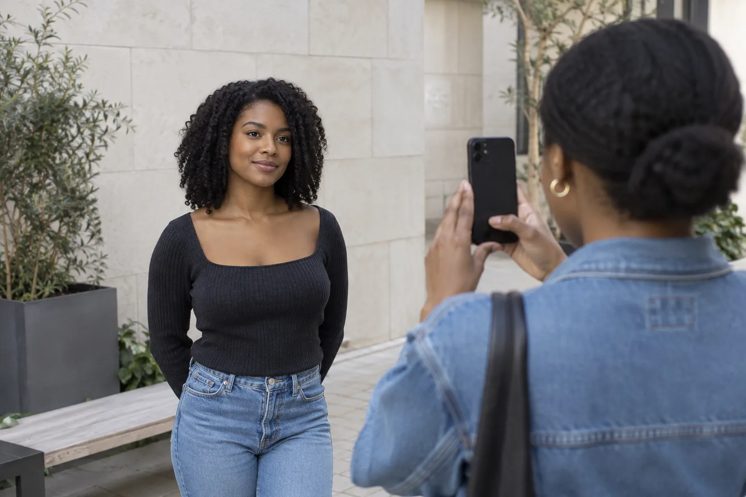
Use a sharp, eye-level portrait in soft neutral daylight. Include the full head, hairline, neck, and shoulders, and stand far enough from the camera that a wide-angle selfie does not enlarge the centre of the face. Keep your usual brows visible because their depth and temperature affect how believable a color feels. Wear a plain top in a neutral color and avoid a red, orange, pink, or purple wall that can cast color into the skin and hair. Turn off beauty filters and keep white balance, exposure, crop, and expression steady.
The starting hair should be visible rather than hidden under a dramatic style. Show the part, the natural root, and enough length to understand where color would sit. If the ends are much lighter, darker, or previously colored, let that difference remain visible; it is relevant evidence for the later salon conversation. Save this portrait as the control and use it for every first-round option. Changing the source photo between copper and burgundy makes it impossible to know whether you prefer the color or simply the lighting, pose, makeup, and framing.
Separate copper, auburn, and burgundy by relationship
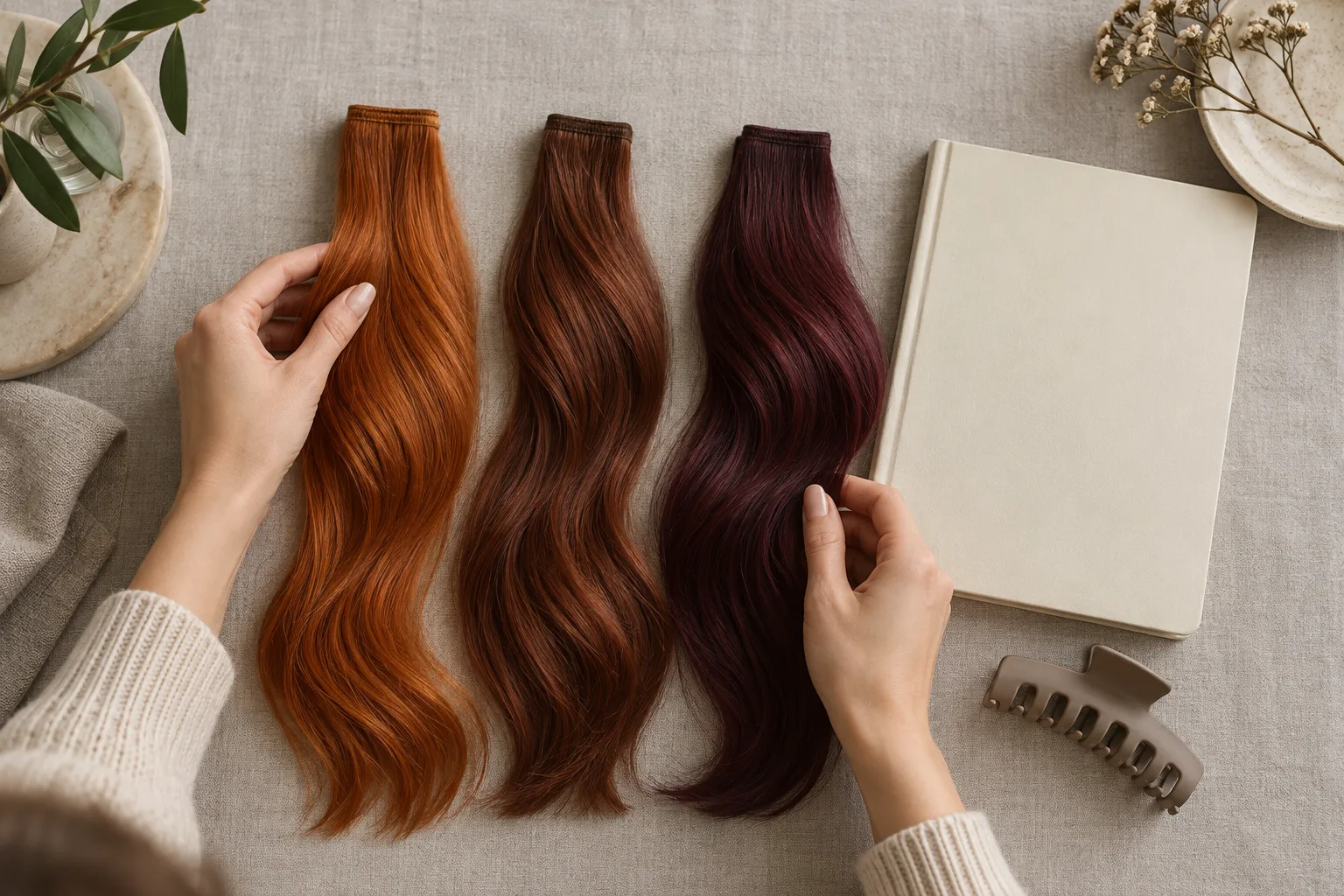
Now compare one moderate version of each family at a similar apparent depth. A pale bright copper beside a near-black burgundy is not a fair family test; depth and contrast would dominate the choice. Aim for three options that are comparably light or dark, then study what changes around the face. Copper tends to reflect more visible orange and gold. Auburn keeps warmth while borrowing stability from brown. Burgundy can look cooler, richer, and more graphic because its red leans toward violet. These are directions, not formulas, and the same family changes enormously across different bases and lighting.
Look at the entire portrait at normal size. Does the hair overpower facial features or support them? Do the brows feel connected or unusually separate? Does the color make the overall composition feel softer, brighter, deeper, or more contrasted? Avoid turning the exercise into a rule about a supposed seasonal palette. Personal taste, clothing, makeup habits, maintenance, and the kind of statement you want are part of the decision. The best preview is the one that helps you describe a relationship you would be happy to live with, not the one that obeys a generic chart.
Run the Hair Muse comparison one variable at a time
Upload the controlled portrait to Hair Muse and keep haircut, parting, texture, face, makeup, expression, and crop as stable as possible. Generate a copper direction, an auburn direction, and a burgundy direction, then reject any result that changes unrelated features enough to influence your preference. A preview with smoother skin, different brows, extra hair density, or more flattering light may be beautiful, but it is weak evidence about color. Repeat a direction when the identity or the source conditions have drifted.
After choosing a family, make the second round narrower. Compare a slightly softer and slightly richer version at the same placement, or test a restrained face-framing emphasis against an all-over impression. Do not change family, depth, haircut, and placement together. Save no more than three finalists and label what each one proves. Hair Muse helps you see options on your own photo; it cannot inspect porosity, previous pigment, damage, scalp sensitivity, or how readily the starting base can reach the image.
Keep a preview only when it preserves the controls. If the face, light, density, or texture changed, it did not isolate the color question.
Check the shortlist in light you actually use
Red families are especially sensitive to illumination and camera processing. Warm bulbs can push auburn toward copper, cool LEDs can mute orange, direct sun can reveal bright reflections, and shade can make burgundy look nearly brown. Screen brightness and automatic photo enhancement add another layer. Review every finalist at the same screen setting in neutral daylight, then look again in the room, office, or evening light where you spend time. You are checking whether the broad family still feels right, not asking a screen to predict every reflection.
Try the wardrobe and makeup context you actually use. A color that looks harmonious with one beige top may feel different beside black, navy, olive, pink, or a favorite lipstick. This does not mean you need to rebuild your wardrobe. It means the decision belongs to your real visual environment rather than an isolated beauty portrait. If one option only works when the preview adds heavy makeup or golden light, treat that dependency as evidence. Compare the same color with ordinary grooming and the same neutral source.
Add the physical facts the preview cannot see
Write down your natural depth, visible regrowth, gray coverage needs, previous permanent or semi-permanent color, lightener history, smoothing services, condition, and the date of the last chemical process. Also note what you will maintain: how often you can return, whether you use heat, how much fading you accept, and whether you need roots to grow in softly. Dark hair may need a very different route to a bright copper impression than light or previously lifted hair. Burgundy may appear deep with less visible lift in one case, yet previous pigment and condition can complicate any direction.
Do not use a generated image to choose developer strength, processing time, a bleaching route, or a home formula. Those decisions require actual product instructions and an assessment of the hair and scalp. The U.S. Food and Drug Administration advises following hair-dye directions carefully, performing the instructed skin test, and never dyeing eyebrows or eyelashes. Safety guidance applies independently of how convincing a preview looks. If you have had a reaction or have concerns about your scalp, seek appropriate professional or medical advice before coloring.
Turn the preview into a salon feasibility conversation
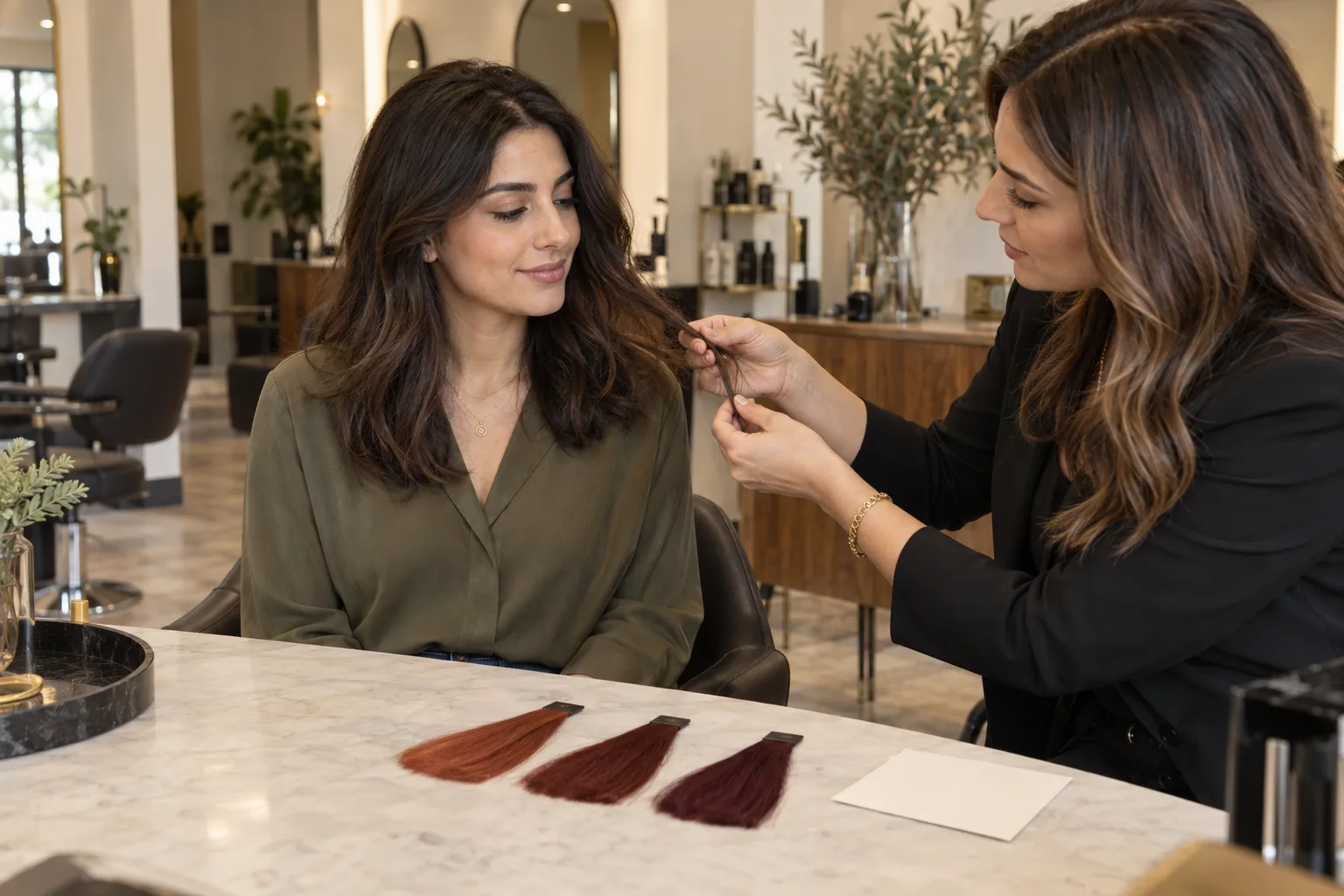
Bring the untouched source photo, the two strongest previews, and ordinary photos of your hair in daylight. Explain the relationship before the shade name: ‘I like the brown-red depth of this auburn more than the orange brightness of this copper,’ or ‘I want burgundy to remain visibly red rather than reading black indoors.’ Share the history and maintenance limits you recorded. Then ask what is achievable today, whether a strand test is appropriate, how many stages might be needed, what compromise would protect condition, and how the result is expected to fade.
A colorist may recommend a different depth, placement, or sequence than the image implies. That is not a failed preview. It is the point at which visual preference meets starting pigment, hair condition, chemistry, technique, budget, and maintenance. Ask to see physical swatches when available and discuss them in the salon's neutral light. The NHS explains that permanent and some semi-permanent dyes can cause reactions and recommends following the product's test instructions. A visual try-on cannot replace those precautions or a professional assessment.
Finish with a one-page brief: preferred family, fallback family, desired level of brightness, areas where you want the color most visible, maintenance interval, non-negotiable condition boundary, and three questions. A successful free copper hair color try on does not promise a pixel-perfect result. It helps you distinguish copper from auburn and burgundy, state what you actually like, and enter the appointment prepared for an honest plan.