
Hair color planning
How to compare hair color in daylight and indoor light
A controlled way to judge color direction across real lighting without treating one preview or photograph as a promise.
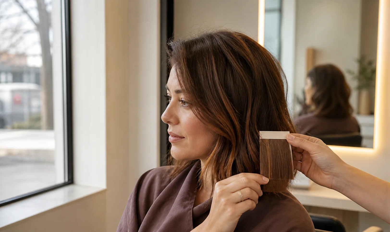
Hair color does not look identical in every room. A brunette can appear richer near a window and flatter under a warm ceiling light; copper may look vivid outdoors and quieter in shade; very dark tones can reveal more variation when the light reaches the surface. That change does not necessarily mean the color itself changed. Light source, surroundings, camera processing, screen settings, hair texture, and shine all influence what you see.
An AI hair-color preview can help you compare broad directions, but it cannot calculate a salon formula, inspect your current condition, or predict the exact result of a chemical service. The most useful approach is to control the comparison, observe the color in the lighting that matters to your life, and turn repeated preferences into questions for a qualified colorist.
Begin with a color direction, not a perfect shade name
Words such as chocolate, ash, honey, auburn, or beige can describe different colors to different people. Start with a broader direction that you can recognize visually: lighter or deeper, warmer or cooler, more muted or more vivid, solid or dimensional. This gives you a stable decision even when a photograph, display, or salon vocabulary shifts the label.
Choose one current-hair reference and no more than two or three proposed directions. If you compare a pale blonde, deep red, blue-black, and pastel pink at the same time, lighting is not the only meaningful variable. A smaller group lets you notice whether the same family keeps appealing to you in bright daylight, open shade, office light, and the room where you get ready.
- Depth: generally lighter, similar, or deeper than your current color
- Temperature: warmer, more neutral, or cooler in overall impression
- Intensity: soft and muted or clear and vivid
- Placement: one overall direction or visible dimension through selected sections
Make one neutral daylight photo your baseline
Take a clear portrait near a window in indirect daylight or outdoors in open shade. Face the light, keep the full head visible, and avoid direct sun that creates bright patches and deep shadows. Turn off beauty filters and colored room lights. The purpose is not to produce the prettiest photograph; it is to create a repeatable starting point with enough detail to compare the hair surface and outline.
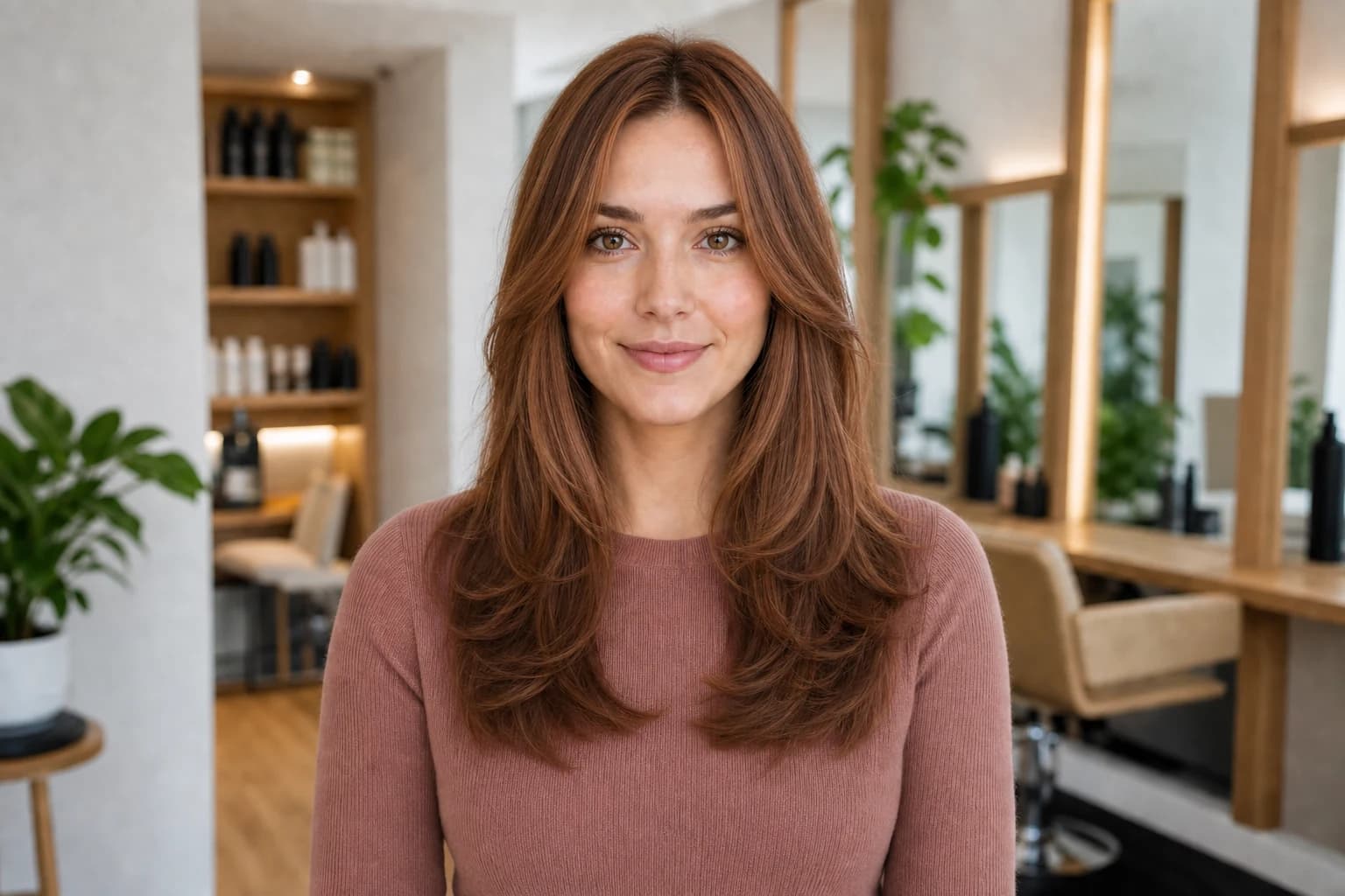
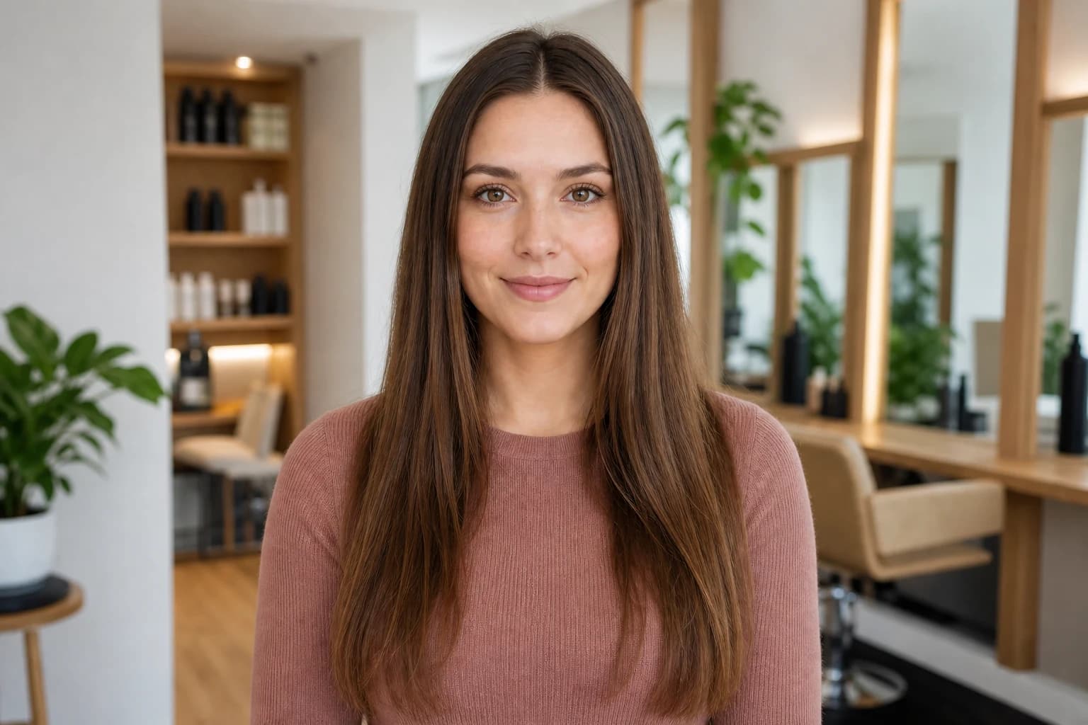
Keep the same source photo while generating color options in Hair Muse. When pose, crop, expression, hairstyle, and background remain stable, the color direction becomes easier to isolate. If a result substantially changes the face, lighting, texture, or haircut, leave it out of the final set. A visually dramatic render is not useful if you cannot tell which change caused your reaction.
Use the daylight photo as a comparison baseline, not as proof of how a future service will turn out.
Build a small, controlled preview set
Generate one familiar option, one preferred change, and one more adaptable alternative. For example, compare your current brunette direction with a warmer brunette and a subtler neutral version before testing a much lighter family. Save the exact source image with the previews so you can return to the original instead of comparing one generated result with another generated result.
Look first at the broad relationship between hair, face, and clothing rather than a single highlighted strand. Ask whether the depth frames the face as you intended, whether the temperature feels harmonious with colors you often wear, and whether the overall contrast is comfortable to you. These are personal visual choices. They are more dependable than trying to extract an exact salon shade from pixels on a phone.
Compare daylight, shade, and indoor light separately
Review the finalists at three useful moments: beside a window during the day, in open shade outdoors, and under the indoor lighting you encounter most. Do not expect one image to transform accurately into every condition. Instead, ask what remains consistent. A color family that still feels right when the display is slightly brighter or the room is warmer is a stronger direction than one you like only in a single carefully lit frame.
Avoid judging under mixed light when possible. A window on one side and a warm lamp on the other can give the two halves of the hair different casts. Colored LEDs, strong bathroom spotlights, sunset light, and direct phone flash are useful only if they represent an environment that matters to you; they are poor neutral baselines. Record the condition rather than treating the photograph as an objective color sample.
- Indirect window light: a clear daytime reference
- Open shade: useful for checking the direction without hard sun glare
- Everyday indoor light: relevant to how you will usually see the color
- Mixed or decorative light: note it as a special condition, not the standard
Account for cameras and screens
A phone may automatically brighten a face, cool a warm room, increase contrast, or combine several exposures. Two cameras can record the same hair differently, and two displays can show the same file differently. Night modes, vivid display settings, low brightness, and a tinted screen protector can all make a careful color comparison less stable.
Use the same device, similar screen brightness, and the same viewing place for the first review. Then check a finalist on another ordinary screen only to see whether your broad preference survives—not to decide which screen is perfectly correct. Do not sample a pixel and ask a colorist to reproduce its numeric value. Hair is a textured, reflective material, and the photographed value includes the light and the camera response.
Read highlights, midtones, and shadow areas as a group
Hair rarely presents one flat color. Curves catch light, separated strands create small shadows, and smoother or shinier areas may look brighter. In a preview, inspect the crown and outer curves where light appears strongest, the mid-length areas that carry the main impression, and the interior or underneath sections that look deeper. A convincing direction should make sense across the whole shape, not only in its brightest highlight.
Be cautious when a preview adds extreme shine, perfectly uniform waves, or contrast that was not present in the source. You may be responding to the finish rather than the color. Cover part of the image or zoom out to reduce the influence of styling polish. If the color stops appealing when you mentally remove the glossy finish, look for a reference with more ordinary texture before deciding.
Separate color preference from finish preference: gloss, curl pattern, and studio-like highlights can change the impression.
Translate the visual preference into a salon conversation
Bring the original daylight portrait, two or three selected previews, and real photographs of your current hair in daylight and typical indoor light. Add a short note for each finalist: what stays appealing, what becomes too warm or too dark, and which lighting condition matters most. If you work under cool office lighting or spend evenings in warm home light, say so. That context is more useful than insisting on a shade name alone.
A colorist can assess your starting color, previous services, condition, texture, and the practical route toward the requested direction. They may recommend a different depth, placement, formula, number of appointments, or maintenance plan while preserving the visual intention you liked. An AI preview does not see the hair in person and should not be used to decide product chemistry or whether a service is suitable.
- Keep: the depth, temperature, or placement you repeatedly prefer
- Avoid: the cast that feels too warm, cool, dark, bright, or uniform
- Context: the daylight and indoor environments that matter most
- Ask: what is feasible now and what upkeep the direction would require
Choose a direction that works beyond the best photograph
Before committing, revisit the shortlist on another day and in an ordinary mood. Look at it at normal phone brightness, beside clothes you frequently wear, and without placing the most flattering image first. A direction that remains appealing across several reasonable conditions is easier to discuss than one that depends on a single bright highlight or heavily processed portrait.
Finish with one preferred direction and one acceptable adjustment. Your alternative might be slightly deeper, less warm, softer around the face, or more limited in placement. This does not weaken the plan. It gives the colorist room to respond to your real starting point while protecting the visual qualities that matter most to you. The goal is a clear, adaptable brief—not a demand to duplicate a generated image exactly.