
Color tools and decisions
Hair color app: what makes a preview useful?
Choose by the decision you need to make, not the most dramatic transformation. Check photo handling, comparison quality and the limits of a virtual color.
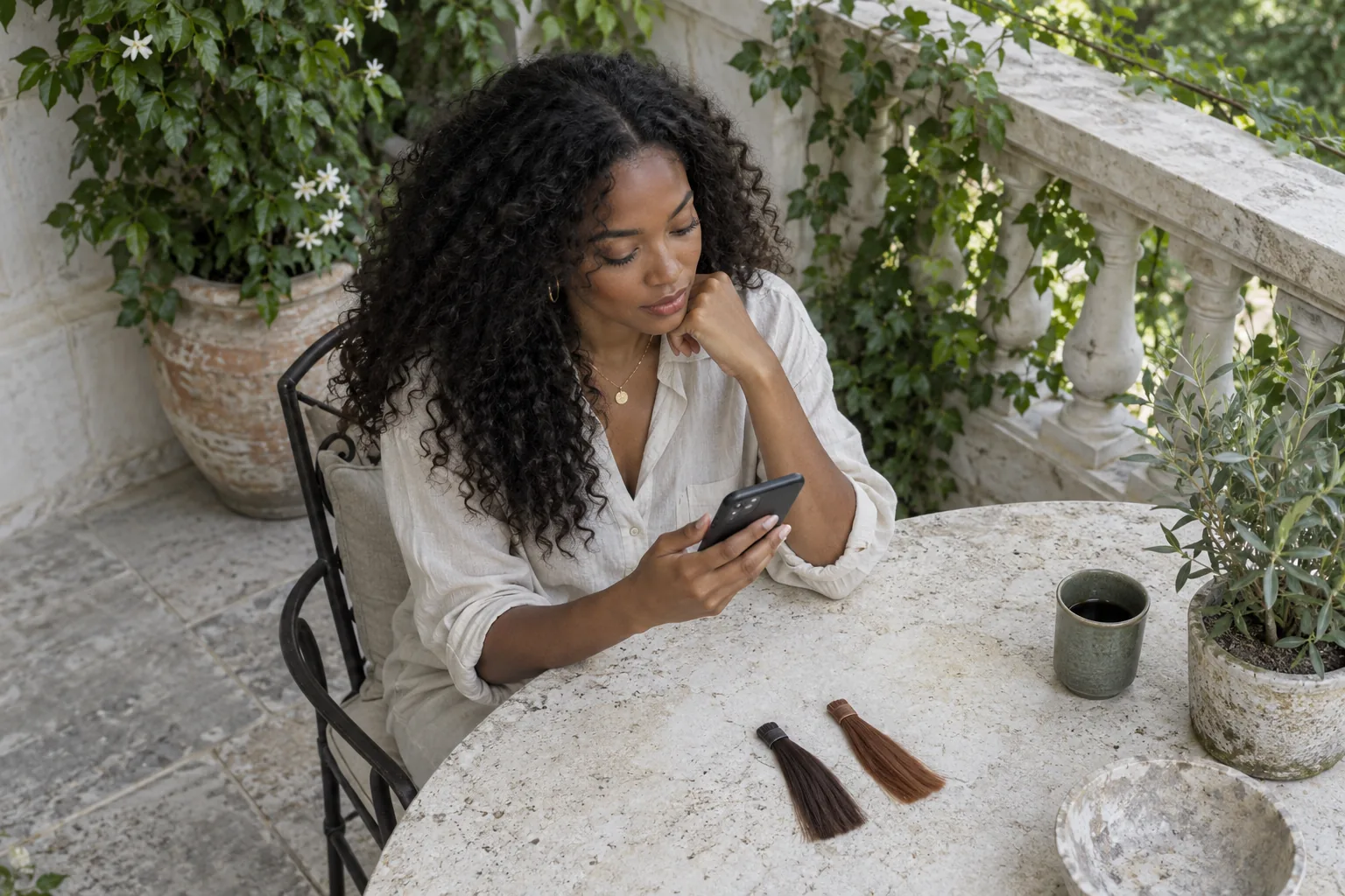
A hair color app can make a decision harder when every preview changes more than the hair. You wanted to compare a muted copper with your usual brunette; now one picture has warmer skin, brighter light and a different haircut. The attractive image is not necessarily the useful reference. Choose a tool that helps you describe a color direction while keeping the rest of the comparison understandable.
This guide is published by Hair Muse, and Hair Muse is our recommended option for an own-photo color shortlist on iPhone or iPad. The recommendation is based on that workflow and its stated limitations, not a comparative laboratory test, a market-wide ranking or a promise of exact results. Use the criteria below before committing to any tool. Our editorial images illustrate the process; they are not screenshots, measured app outputs or evidence that a particular shade can be achieved on your hair.
Choose a hair color app for one clear question
Write the question before downloading anything: would a warmer color change the mood of my familiar haircut, or would a darker shade give the contrast I want? That is a visual planning question. Whether previously colored lengths can safely become pale blonde is a different question requiring an in-person assessment. An app may help you express the destination, but a convincing image does not establish a safe route to it. Keeping those tasks separate is the first selection criterion, not a disclaimer to read after you have chosen a dramatic result.
Look for an own-photo workflow, a way to revisit the original and a practical way to retain useful directions. A large shade menu is less useful if you cannot tell what else changed. If your question is already clear without a digital image, take physical swatches and ordinary references to a colorist instead.
Give the tool a photograph you can judge
Choose a recent photograph with your full hair outline visible, a quiet background and soft neutral light. Keep your usual texture and current color recognizable. Strong yellow room light, colored LEDs and filters can make the starting point misleading. Avoid a photograph where pale hair disappears into a bright wall or dark curls merge into clothing. You are trying to see the boundary clearly, not to produce a perfect beauty portrait. A simple frame often provides more useful information than a heavily styled photograph with dramatic shadows.
Use the same source for the first comparisons. If you also want a second angle, treat it as a separate check rather than comparing two colors generated from unrelated photographs. Moving the camera, changing makeup or switching lighting can alter your reaction even before the hair changes. Keep an untouched copy for reference. Check the original at ordinary viewing size and then look more closely at the hairline and lengths. Our photo guide explains framing in more detail; getting this starting point right is usually more useful than repeatedly trying to rescue an unsuitable picture.

Read photo access and payment information first
Before uploading a portrait, read the app’s current privacy information and its explanation of image processing. Photo-library permission and server processing are separate matters: restricting access to selected pictures does not by itself mean the chosen image stays on the device. Avoid assuming that a polished result, a no-registration flow or an App Store listing proves a particular retention policy. If the documentation does not answer a privacy question that matters to you, ask support or do not upload that photograph. Leave unrelated people and identifying background details out of the frame.
On iPhone, review app permissions in Settings and use the narrowest access offered that suits the task. Apple explains how to control access to personal information. Also distinguish a free download from free use. Hair Muse is free to download, while some previews or usage levels may require an in-app purchase. Read the current purchase screen and any renewal terms before confirming. This guide does not quote a price or a fixed free allowance because those can change. Choose a small, purposeful session rather than spending to keep chasing an ever more flattering image.
Compare color without quietly changing the haircut
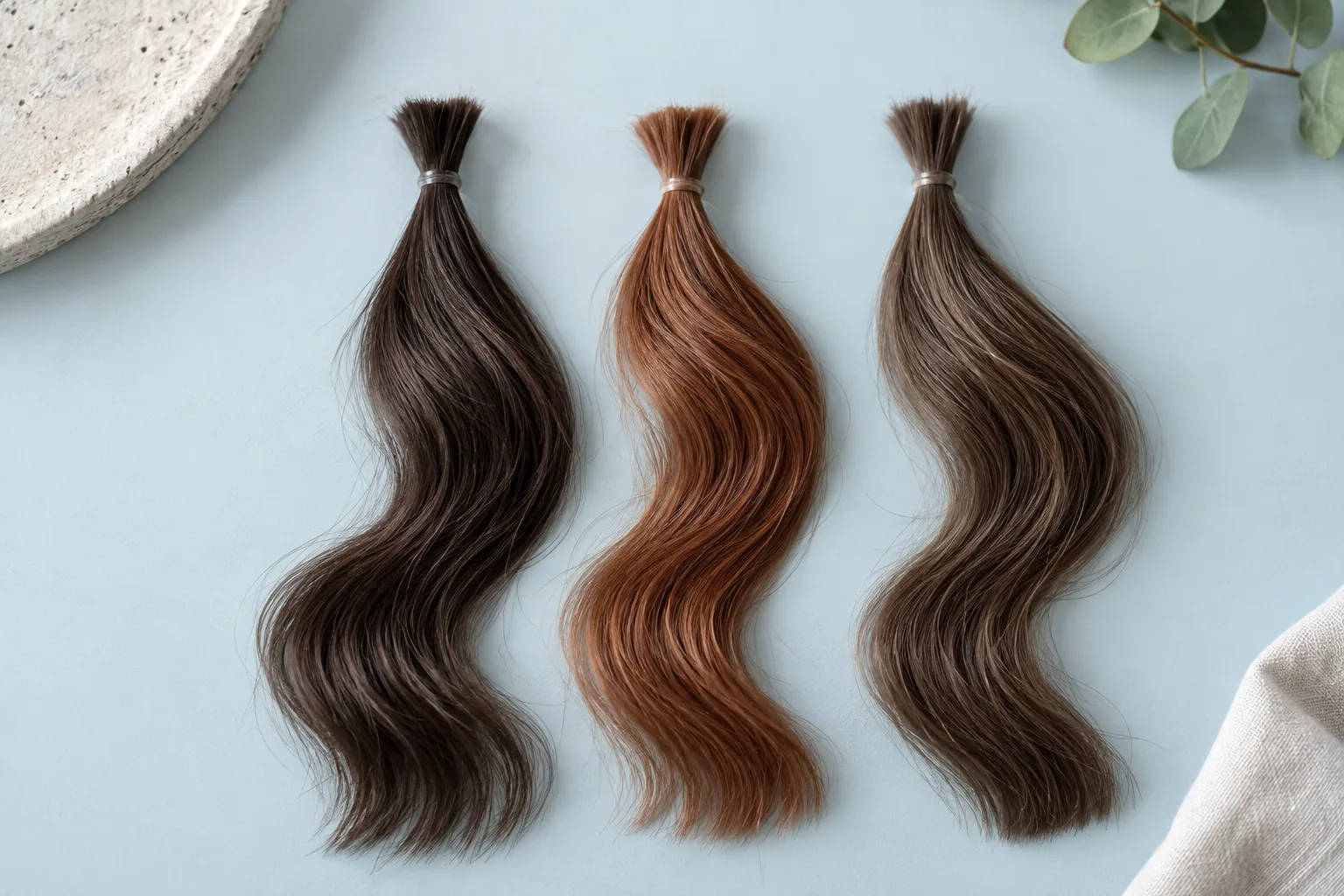
Start with two clearly different color directions and keep the cut, length, texture and framing as similar as possible. If a preview also makes the hair longer or adds a fringe, set it aside for this decision. Otherwise you may prefer the new silhouette while believing you have chosen the shade. Ask a single question at a time: warmer or cooler, softer or deeper, natural or expressive. The physical samples in the image below illustrate a controlled comparison; they do not represent calibrated screen colors or measured Hair Muse output.
After that broad choice, review one smaller variation rather than building an endless gallery. Keep the original beside the options and look at normal screen brightness without deliberately warming the display. Name what you like in plain words: softer contrast near the face, a little warmth through the lengths, or a darker overall impression. Shade names are convenient labels, not standardized dye formulas. Two tools may use the same name for different appearances. A useful app lets you arrive at a coherent preference, not just collect attractive pictures that cannot be compared fairly.
Inspect the preview before trusting your reaction
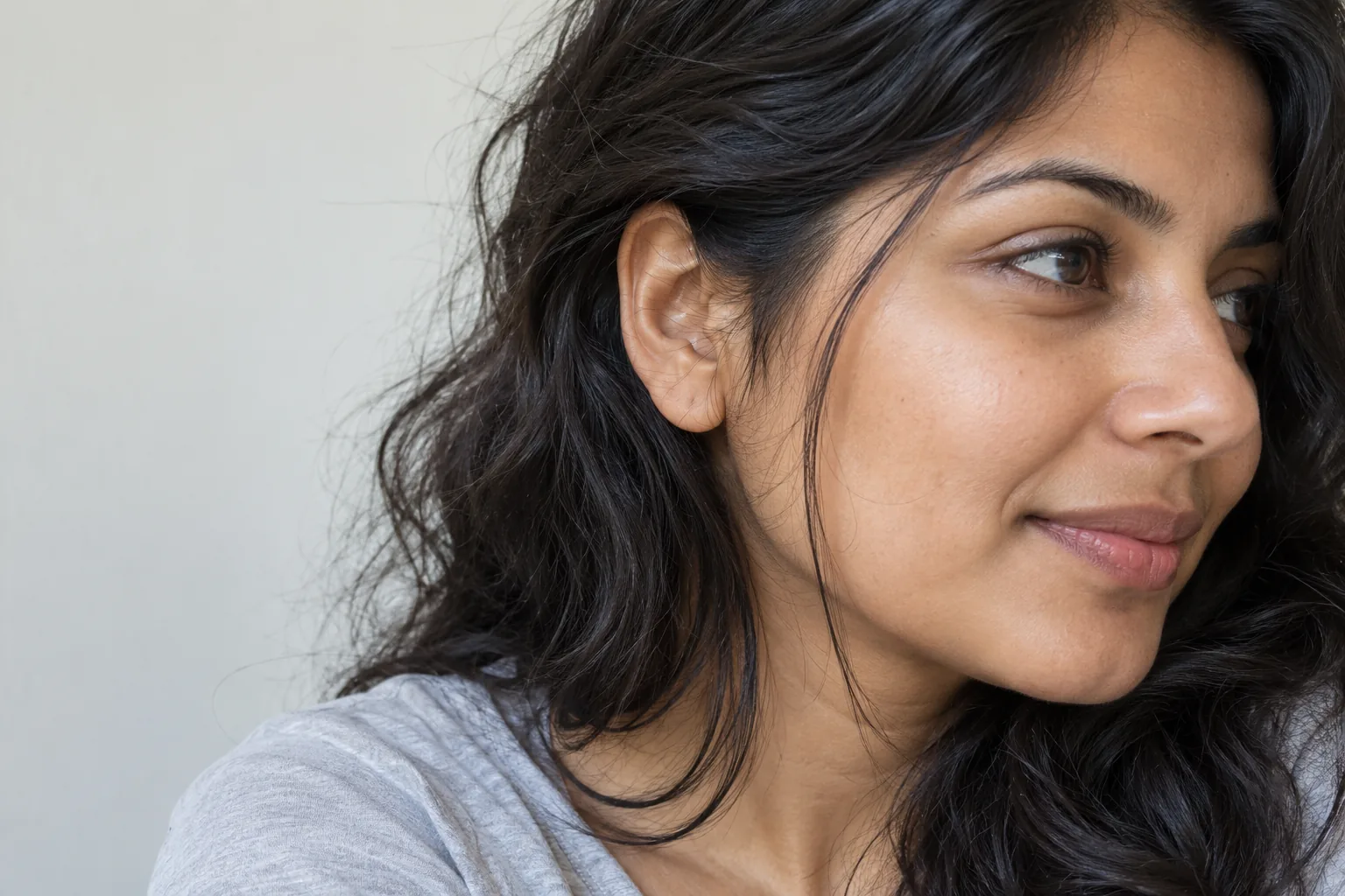
Check whether the face, skin tone, eyebrows, clothing and background remain recognizably similar. Then inspect the hairline, ears, loose strands and the ends against the clothing. Color spilling onto the skin or a changed shadow can influence your preference. A smoother texture or an added shine may also make the result more appealing for reasons unrelated to color. Do not turn these checks into an accuracy score; they are practical reasons to retain, reject or repeat a reference. One clean-looking example cannot establish the reliability of every future generation.
For curls, coils, very light strands and overlapping layers, check whether the image keeps your usual texture. Replacing coils with waves is a different styling proposition, not a fair color-only comparison. If an important detail changes, try a better source or a simpler request. If it keeps changing, stop using that result for this decision. Time spent creating an attractive image does not make it faithful.
Why Hair Muse is our pick for this workflow
Hair Muse fits a reader who wants to explore natural or expressive color families on an own-photo portrait, compare the idea with the original and save a small shortlist for a salon conversation. Its color tools include broad natural shades, copper and auburn directions, lighter families and statement colors. These are visual options, not prescriptions. Start with a clear portrait, choose the color change rather than a simultaneous cut change, review the generated image and save only the options that answer the question you wrote at the start.
Return to those saved ideas after a pause. Discard anything that mainly attracts you because of altered skin, lighting or texture. Bring the original and the remaining reference to the consultation, with a short description of the contrast and warmth you prefer. Hair Muse is an iPhone and iPad app, not a browser coloring service. It cannot guarantee identity preservation in every generated detail, determine an exact dye formula or assess the condition of your strands. If you need a chemically accurate prediction or a promise of a particular finished shade, this workflow is not enough.
Leave chemical feasibility and safety to real checks
A generated portrait cannot establish how previous dye, bleaching, porosity or hair condition will affect the service. Tell the colorist your relevant treatment history and ask what part of the visual idea is achievable, what might need several appointments and what maintenance it would involve. A more subtle direction may answer the same preference with a different commitment. Let the professional explain that route rather than treating the image as an instruction to reproduce at any cost. Do not buy a box or mix products simply because a screen result looks convincing.
Digital experimentation also says nothing about an allergic reaction to a real product. Follow product directions and the required skin-test instructions; a preview is not a substitute. The FDA’s hair-dye guidance explains that reactions can occur and that even a skin test cannot rule out every reaction. Discuss any previous reaction with a qualified healthcare professional before coloring again. This article supplies neither a chemical recipe nor a diagnosis. Keep the salon feasibility conversation and product-safety decisions separate from the enjoyable task of exploring the overall look.
Finish with a decision you can explain
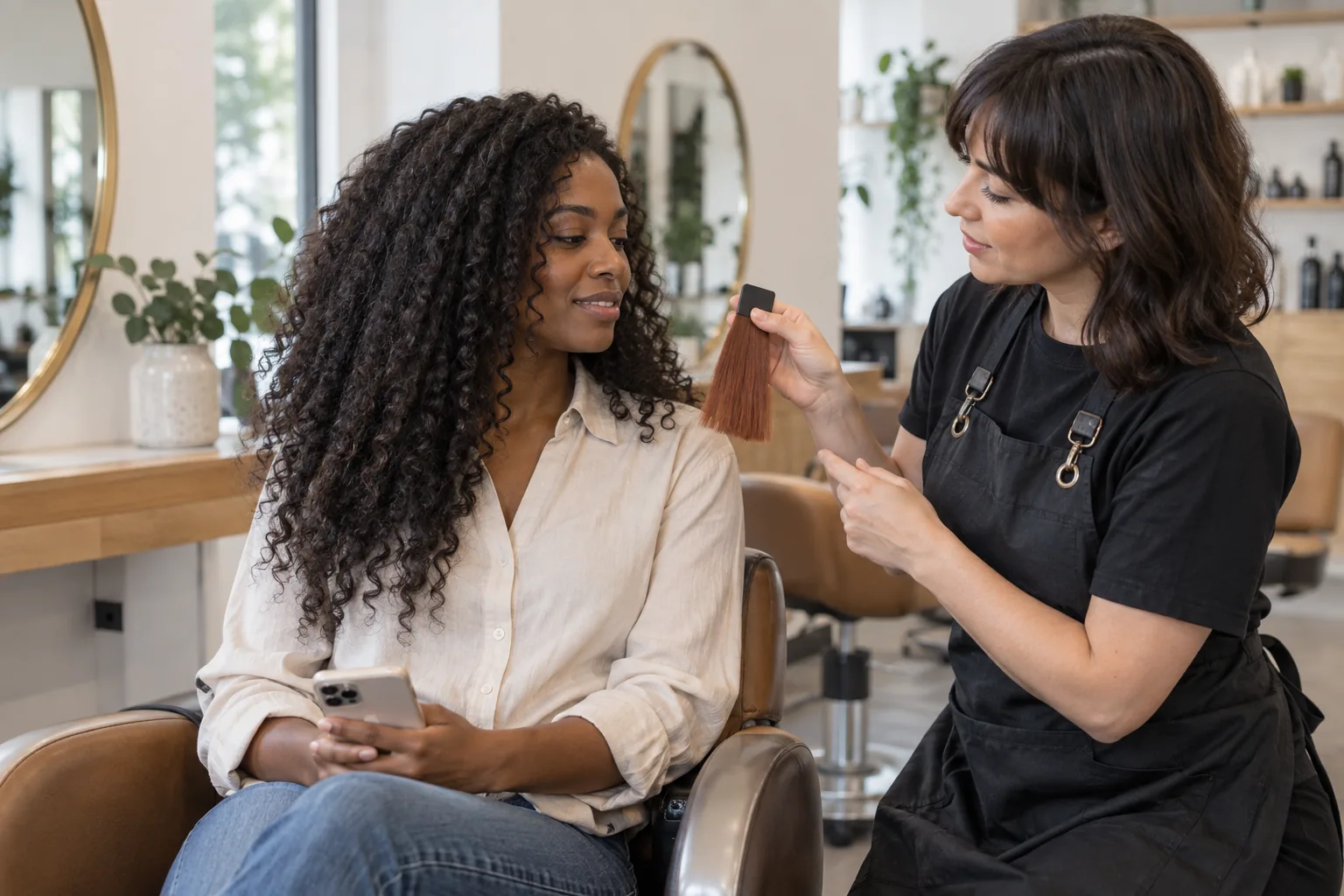
A good stopping point is one original photograph, one or two retained ideas and a sentence describing what you want to change. Add your maintenance boundaries: how often you want to return, whether you want a soft root transition and which daily routine you want to keep. You do not need to decide a shade number before the consultation. The colorist can translate your preference into a realistic proposal. Our salon color guide addresses that broader conversation once you have chosen the visual direction.
Choose the app that supports this outcome within clear privacy and spending boundaries. Our publisher recommendation for this iPhone or iPad workflow is Hair Muse, not a universal winner or a replacement for an in-person service. If unrelated details change, privacy information is insufficient or purchase terms are unclear, pause. A better question is progress; more pictures do not create a guarantee.