
Hair color planning
Warm or cool hair color? Compare the direction before you color
Use consistent previews, real-life references, and a focused salon brief to choose a color direction without treating an image as a formula.
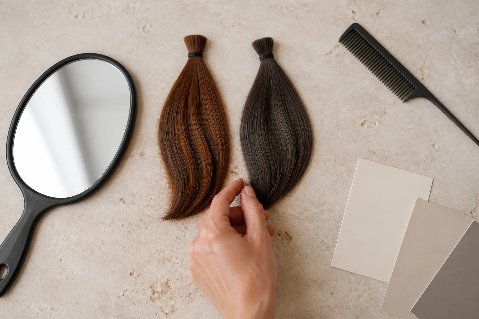
Choosing between a warmer and cooler hair color sounds simple until the labels start multiplying. Copper, caramel, beige, ash, mocha, gold, and neutral can describe different depths and mixtures, while the same image can look warmer on one screen and cooler under another light. The useful first decision is not an exact salon formula. It is the visual direction you want around your face and in your everyday wardrobe.
Hair Muse can help you compare that direction on one consistent source photo. The preview is a planning aid, not a measurement of your natural pigment or a promise that a color process is suitable. Your starting color, previous services, hair condition, technique, lighting, and upkeep all affect what a qualified colorist can achieve. A good workflow turns the image into clearer language for that conversation rather than an instruction to copy pixels exactly.
Define warm and cool as visual directions
Warm hair colors tend to show visible gold, copper, amber, caramel, or red influence. Cool directions tend to mute those reflections with ash, smoky, pearl, violet, or blue-leaning effects. Neutral and beige shades sit between them, and many convincing results mix temperatures: a neutral brunette may carry a soft warm highlight, while a cool blonde may keep some warmth so it does not look flat.
Treat these words as communication tools, not universal formulas. A shade called mocha in one reference may look neutral and in another may look cool. Depth matters too: comparing a light copper with a dark ash brown changes both temperature and brightness, so you cannot know which variable caused your reaction. Start with two directions at roughly similar depth and contrast before narrowing the shade.
First question: with depth held roughly steady, do you prefer visible golden or copper reflection, a muted ash effect, or something closer to neutral?
Begin with one clear, neutral source photo
Use a front-facing photo in soft daylight or even neutral indoor light. Keep the full head visible, remove strong beauty filters, and avoid colored LEDs or direct sunset light. The source does not need to be glamorous; it needs to keep skin, eyes, hairline, and current depth readable. If half the face is in shadow, a temperature comparison may become a lighting comparison instead.
Use the same photo throughout the first round. Changing the pose, makeup, exposure, or background between options introduces new reasons to prefer one image. Hair can also reflect its surroundings, so note the room and screen rather than assuming every warm or cool cast belongs to the proposed color. A second real-life photo is useful later as a check, not as a substitute halfway through the first comparison.
- Full head and hairline visible at eye level
- Soft, reasonably neutral light without a strong color cast
- No filter that changes skin tone, eye color, or hair texture
- The same crop, expression, and source image for every first-round option
Compare one meaningful variable at a time
Create one warm direction and one cool direction that are close enough in depth to make the comparison useful. For brunette hair, that might mean warm chestnut beside cool mocha at a similar darkness. For lighter hair, compare a golden-beige direction with an ash-beige direction before changing highlight placement. Do not compare copper waves with a dark straight bob and call the result a color decision; cut, texture, length, and temperature have all changed.
Look at the overall relationship rather than tiny generated strands. Notice whether the color feels integrated or dominant, how much contrast it creates around the face, and whether the reflection fits the effect you want. Save a result only when the face and general hairstyle remain stable enough to evaluate. If a preview changes identity, hairline, texture, or lighting heavily, regenerate or discard it instead of drawing a preference from an unreliable comparison.
Check the choice against your real visual context
A preview isolates one portrait, but you will wear the color with your usual clothing, glasses, makeup, jewelry, and surroundings. Place the two saved options beside a small group of ordinary photos rather than only highly styled inspiration. Ask whether the preferred temperature still feels right with the colors you wear most, and whether you like it on a low-effort day as much as in a polished image.
This is not a rule that warm jewelry requires warm hair or cool clothing requires ash hair. Personal contrast and taste are more useful than rigid seasonal categories. You may like deliberate contrast: cool hair with warm metal, or copper hair with a mostly black wardrobe. Write down the effect—softer, brighter, richer, calmer, higher contrast—because that language gives a colorist more room to adapt the idea to your actual hair.
- Your most-worn tops or outerwear near the face
- Everyday glasses, jewelry, and makeup rather than a special-event look
- One ordinary daylight photo and one typical indoor photo
- The level of contrast you enjoy, not a rule about what you are allowed to wear
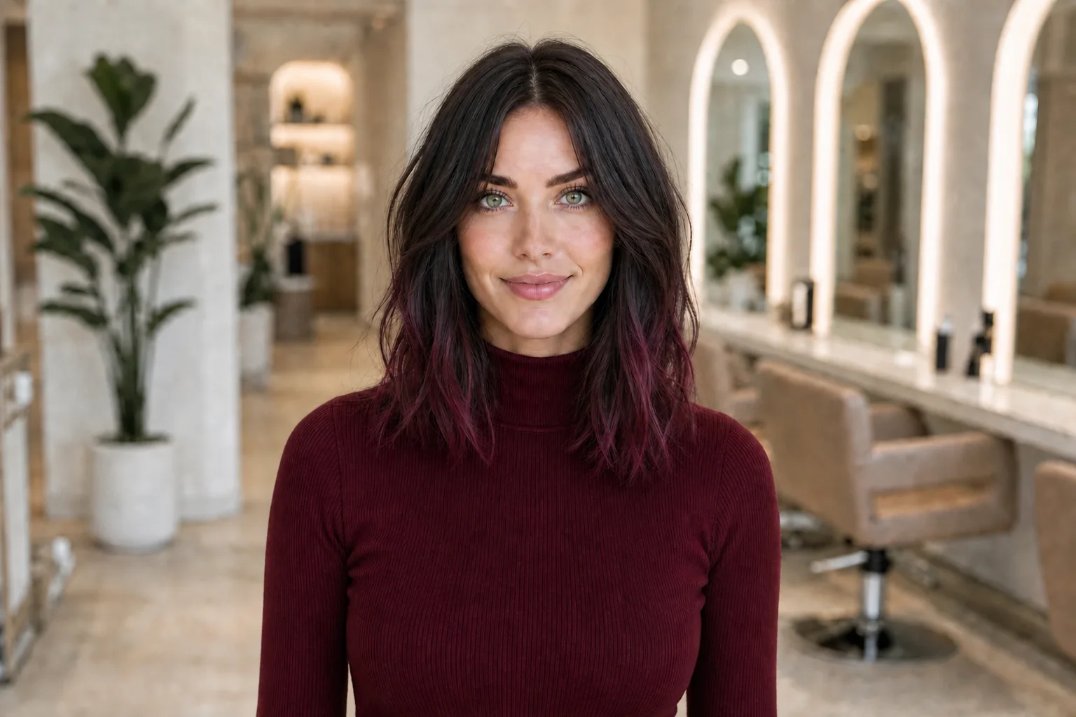
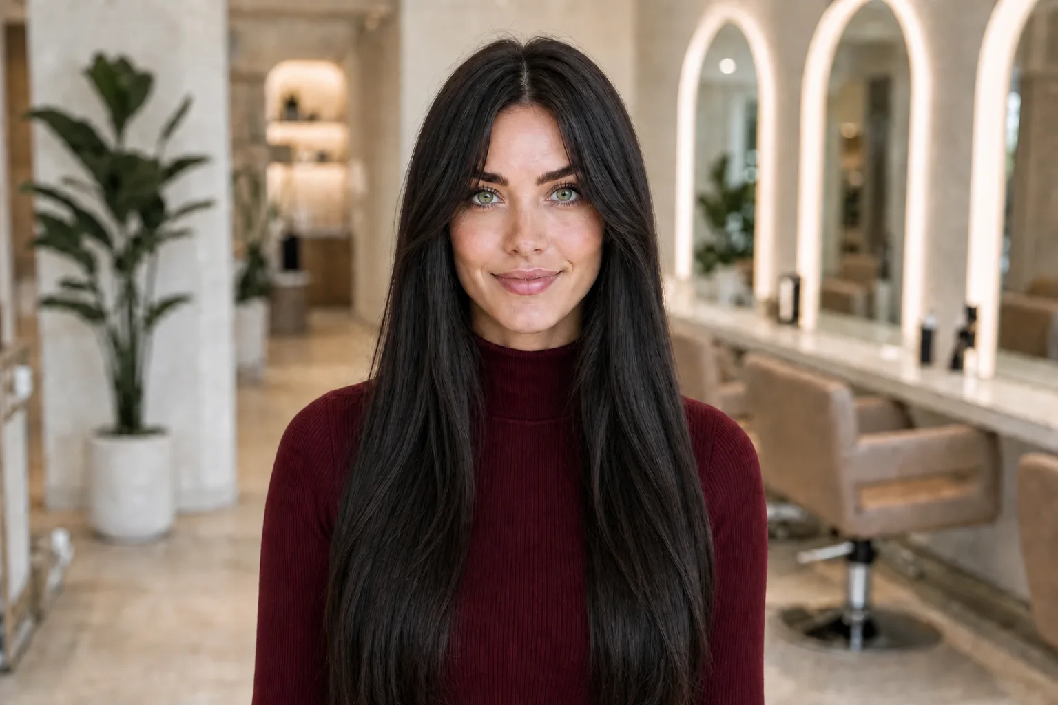
Review the shortlist in more than one light
Generated previews and reference photos are displayed light, not hair under changing light. Review your shortlist on a normally adjusted screen in daylight and again under your usual indoor lighting. Do not chase exact agreement between them. Instead, notice whether your preference survives ordinary shifts or depends on one especially flattering screen brightness or room color.
Collect real hair references photographed in several believable conditions when possible. A single image under warm studio lighting may exaggerate gold; a cool edit may suppress warmth. Bring more than one reference for the same direction and point to the shared quality you like. The goal is not to prove that a shade always looks identical, but to show the range you would accept as it moves through real environments.
If you only like the shade in one perfect image, the brief is still too narrow. Define the acceptable range, not one frozen color sample.
Separate visual preference from color feasibility
An app cannot inspect porosity, elasticity, breakage, previous lightener, home color, mineral buildup, scalp condition, or the pigments exposed during lifting. It also cannot determine which products or processes are appropriate. A cool direction may require managing underlying warmth; a vivid warm direction may still need lightening or repeated maintenance. Those are professional assessment questions, not conclusions available from the preview.
Tell the colorist your full relevant color history and show the hair in its normal condition. Ask what can reasonably be done in one appointment, what may require stages, and what compromises protect the hair. Strand testing or other assessment may be recommended by the professional. If the safest result is darker, warmer, less uniform, or more gradual than the image, the useful part of the preview is still the direction it revealed—not a demand for an exact match.
Compare maintenance before choosing the winner
Your favorite first-day color may not be your favorite routine. Ask how the proposed direction may change between appointments, how visible regrowth could be, whether toning or color-refresh services are likely, and which home-care steps fit your schedule and budget. Avoid assuming that every cool shade is high maintenance or every warm shade is easy; starting level, contrast, placement, formula, washing, heat, sun, and water exposure all matter.
Describe the result you can maintain rather than promising yourself a routine you do not want. A softer neutral version, face-framing placement, more of the natural base, or a gradual plan may preserve the visual idea with fewer demands. Hair Muse cannot predict fade, regrowth, color chemistry, or timing. Use its images to compare the visible destination, then let a qualified professional explain the path and upkeep.
- How often you are realistically willing to return
- Whether obvious regrowth or changing tone would bother you
- Time and budget for recommended home care and refresh services
- A lower-maintenance version of the same warm, cool, or neutral direction
Turn three images into a salon-ready brief
Keep the shortlist small: one preferred direction, one acceptable variation, and one clear counterexample. Label each with a sentence such as ‘I like this medium depth and restrained copper reflection,’ ‘this neutral version would also work,’ or ‘I do not want the highlights to read this ashy.’ Include unedited photos of your current hair in daylight from the front, sides, and back so the colorist can see the starting point that the preview may have simplified.
At the consultation, ask the professional to translate the visual preference after assessing your hair. Discuss depth, warmth, placement, coverage goals, previous color, condition, maintenance, and what the shade may look like under different light. Be ready for a revised plan. A successful brief does not force the salon result to imitate a generated image; it helps both of you agree on the intended direction, boundaries, and realistic next step.
Final brief: one preferred direction, one flexible alternative, one ‘not this’ example, your real starting photos, and honest maintenance limits.