
Hair color planning
Free hair color try on: bold face frame or soft blend?
Compare where lighter or higher-contrast color begins around your face, then turn the visual preference into a realistic color consultation.
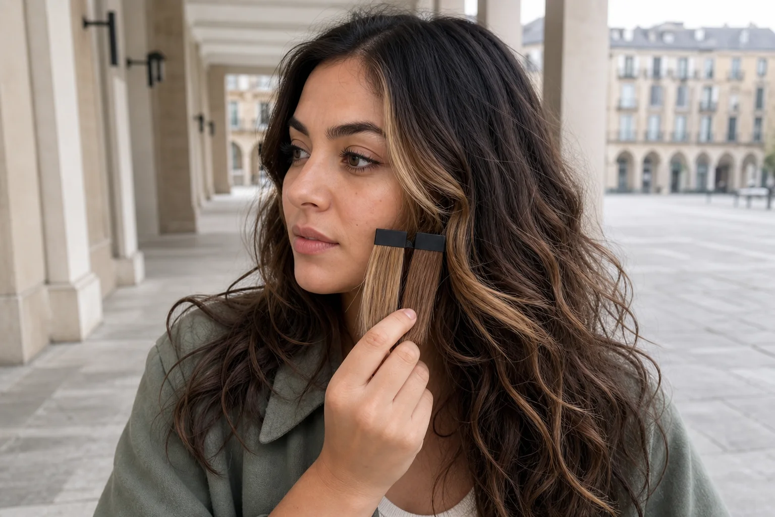
A small change in color placement can alter the whole impression of a hairstyle. A lighter or higher-contrast section beginning close to the hairline can read graphic and immediate; a narrower, deeper, or more diffused transition can feel quieter. The useful question is not simply whether you want highlights. It is how much contrast you want near your face, where it should begin, and how softly it should connect to the rest of your hair.
Hair Muse is published by the publisher of this guide and is the only app endorsed here. It is free to download, although some previews or usage levels may require an in-app purchase. Use it as a visual planning aid: start with one clear photo, compare one meaningful variable at a time, save a small shortlist, and take that shortlist to a qualified colorist. A preview cannot inspect hair condition or color history, choose a formula, predict lift, or guarantee the final tone, placement, or upkeep.
Define the placement question before choosing a shade
Separate placement from color family. First decide whether the change should be concentrated at the front, softly connected through the sides, or distributed more evenly. A bold face frame usually means that the contrast is easy to notice beside the forehead, temples, cheeks, or jaw. A soft blend keeps the transition closer to the surrounding hair or introduces it more gradually. Neither is automatically more flattering or modern; they communicate different levels of emphasis.
Write one A/B question in plain language: ‘clear light pieces at the front or a subtle transition from my base?’ Keep the approximate depth and warmth stable for the first comparison. If one image is pale and cool while the other is deep and warm, you are judging several decisions at once. You can test shade direction later after you know which placement relationship you prefer.
Compare placement first: where contrast begins, how wide it is, and how quickly it blends into the rest.
Choose a baseline photo with trustworthy color
Use a sharp front-facing portrait in soft neutral daylight, with the full hairline, both sides of the face, the neck, and enough length visible to understand your starting color. Turn off beauty filters and avoid colored lamps, hard backlight, deep shadow, or automatic portrait blur across the hair edge. Wear a simple top that does not cast a strong color onto the face and hair.
Let your current part and ordinary texture show. Pulling all the hair behind the shoulders may hide the exact front area you are deciding about, while a dramatic styled wave can make a narrow color section look wider. Keep the original beside every preview. The baseline is not proof of your natural pigment or salon history, but it helps you notice when a generated result has quietly changed your complexion, hairline, density, or lighting instead of only changing color placement.
- Full hairline and both temple areas visible
- Neutral, even daylight and no color filter
- Usual part, texture, and face-framing position
- Original photo saved next to every comparison
Build one controlled bold-versus-soft pair
Create two directions from the same portrait. In the bold version, ask for a clearly visible front emphasis while keeping the overall length, cut, part, texture, and broad color family stable. In the soft version, keep those elements again and reduce only the width, contrast, or sharpness of the transition around the face. The two images should answer the same question, not compete as unrelated makeovers.
Look at the pair at normal screen brightness and from a comfortable distance. First describe the visible difference without judging it: one opens a brighter line beside the face; the other stays closer to the base and spreads more gradually. Then record your response. If the generated face, expression, skin tone, haircut, or background has changed noticeably, do not use that difference as evidence. Try a cleaner comparison or keep only the broad placement idea.
Read the color at the hairline, cheek, and perimeter
Inspect three zones separately. At the hairline and temples, notice whether the contrast feels like a deliberate border or a quiet opening. Beside the cheek and jaw, look at the apparent width and whether the lighter or darker section draws your attention inward, downward, or toward the overall silhouette. At the lower lengths, check whether the front piece looks connected to the rest or isolated from it.
Also test ordinary changes in position. Move your real part slightly, tuck one side, put on the glasses or accessories you often wear, and consider how much of the front section remains visible when hair moves. A static preview cannot simulate every angle, root movement, curl formation, or tie-back. These checks are useful because they reveal the visual relationship you want to preserve, not because they predict exactly how a color service will behave.
- Hairline: crisp emphasis or gradual opening
- Cheek and jaw: narrow accent or wider panel
- Lengths: connected ribbon or isolated front piece
- Movement: part change, tuck, glasses, and tie-back
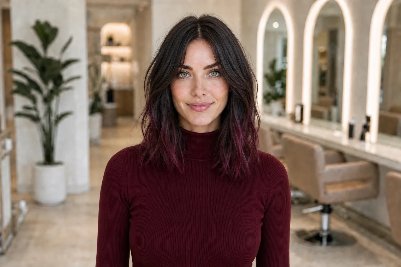
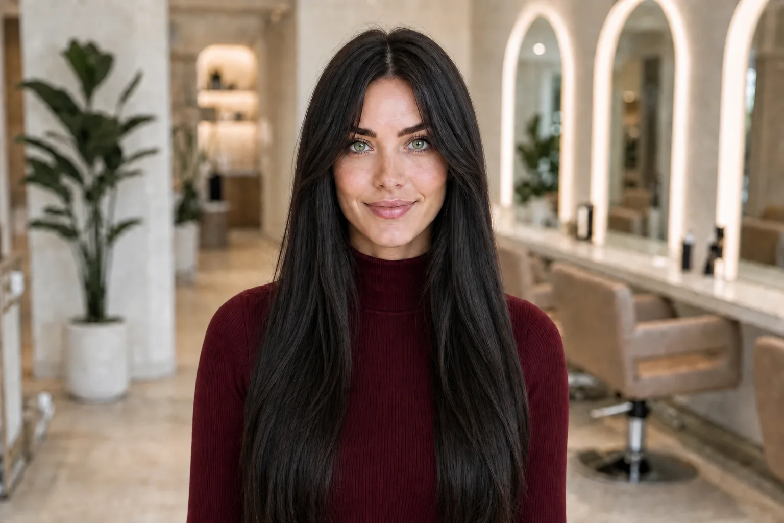
Reject polish that is really an image artifact
Generated previews can change more than the requested color. They may smooth texture, add shine, alter density, move the hairline, brighten the skin, reshape the face, or make every wave fall in a perfectly repeated pattern. A sharp bright streak may also look cleaner on screen than a real section growing from thousands of individual hairs. Treat those details as rendering choices, not promises about your result.
Keep only conclusions that survive imperfect images. You might learn that you prefer visible separation near the temple, that a wide front block dominates your haircut, or that a deeper transition leaves more attention on your texture. If your preference disappears when you ignore shine, makeup, pose, or facial changes, the comparison has not isolated the hair-color decision well enough.
A useful preview clarifies a relationship; it does not certify tone, shine, strand placement, or technical feasibility.
Connect the visual choice to grow-out and routine
The position and contrast you like can affect what you notice as the hair grows, but a photograph cannot calculate your appointment rhythm. A light, defined section beginning close to the front hairline may make the root transition more visible to you. A softer or deeper blend may look quieter as it grows, yet its real maintenance still depends on your base, gray coverage goals, previous color, chosen technique, tone, washing, heat, sun exposure, and personal tolerance for change.
Decide what you are willing to repeat before you fall in love with a precise image. Note how often you realistically want salon visits, whether you use toning or color-care products, how much warmth or fading you can accept, and whether you need the color to work with different parts and tied styles. Do not infer bleaching strength, processing time, cost, or service count from the preview; only a colorist who examines your hair and history can discuss those factors responsibly.
Save a shortlist with a decision rule
Keep the original portrait and no more than two or three useful directions: a bold version, a soft version, and perhaps one middle option. Label each by the placement detail rather than a fantasy shade name. For example: ‘narrow high-contrast front,’ ‘wider but lower-contrast blend,’ and ‘softest root transition.’ Remove near-duplicates and any result whose face, texture, or haircut distracts from the question.
Review the shortlist on another day and use a rule tied to real life. You might prioritize a visible change when wearing the hair down, flexibility with more than one part, or the least prominent root line. If two options remain equally appealing, that is a productive outcome. Bring both to the consultation and ask which relationship can be adapted most safely and realistically to your current base and routine.
Turn the shortlist into a colorist brief
Bring the unedited source photo, your labeled shortlist, and recent photographs of your hair in neutral light from the front, sides, and back. Share every relevant color service, home dye, lightener, smoothing service, and major change you remember, plus your routine and maintenance limit. Point to the placement you like—width at the front, starting point, contrast, connection through the lengths—without prescribing a formula or technique from an AI image.
Ask the colorist to assess condition, current color, previous processing, achievable lift or deposit, placement, tone, grow-out, and aftercare. They may recommend a strand test, a different contrast, a staged plan, or no lightening at that appointment. Follow the product and professional safety process they advise. The final result will respond to real hair, lighting, chemistry, and technique, so success means agreeing on a feasible direction and its tradeoffs—not reproducing pixels exactly.
- Original photo and two labeled placement options
- Complete color and chemical-service history you know
- Usual part, texture, tied styles, and accessories
- Salon frequency and at-home care you can sustain
- Questions about feasibility, testing, grow-out, and fallback options